Most cleaning business websites don’t get leads for one simple reason: the site isn’t built to convert intent into action. It might look “fine,” but it’s unclear, slow, untrustworthy, or frustrating on mobile-so people bounce instead of calling or submitting a form.
If you’re confused because you do get visits (or you think you do) but your phone isn’t ringing, this will show you the real blockers-and what to fix first-without pretending I’m a cleaning pro. I’m looking at this purely as a website + conversion system.
The fastest way to think about it
A lead happens when your site does three things quickly:
- Confirms relevance: “Yes, you clean what I need, where I am.”
- Builds trust: “You look legitimate and safe to contact.”
- Removes friction: “I can contact you in 10 seconds on my phone.”
If any one of those breaks, your site can exist for years and still produce nothing but vibes.
[Insert image of a simple “3-part lead system” diagram because it helps non-technical readers understand relevance + trust + friction at a glance.]
Why your cleaning website isn’t converting visitors into leads
This is the part most owners miss: conversion is usually blocked by basics, not advanced marketing.
Here are the most common causes I see when I review local service business websites (including cleaning):
Cleaning website not converting because the top of the page is vague
When someone lands on your homepage, they’re asking: “Can you help me, here, with this type of cleaning?” If the first screen doesn’t answer that, they leave.
Common “vague top section” problems:
- Generic headline (“Professional Cleaning Services”)
- No service area mention
- No clarity on residential vs commercial
- A giant image pushing real info below the fold
This matters because visitors don’t “read” websites at first-they scan for certainty.
Fix: Put a plain-English statement at the top that includes your service, your area, and the next step (call or quote).
Mobile usability breaks the moment of action
Most cleaning leads are mobile. If your site is annoying on a phone, it’s a lead killer-even if it looks great on desktop.
Typical mobile conversion blockers:
- Phone number not tappable
- CTA buttons too small or low-contrast
- Sticky headers covering content
- Forms that feel like a tax return
This matters because mobile users are usually in “get this done” mode.
Fix: Open your site on your phone and try to contact yourself with one thumb. If it feels even slightly irritating, it’s costing you leads.
[Insert image of a mobile homepage with a large tap-friendly “Call” and “Get a Quote” button because it demonstrates what “one-thumb friendly” looks like.]
There’s no single, obvious conversion path
A lot of cleaning sites accidentally give people five different next steps:
- “Call”
- “Email”
- “Book”
- “Request a quote”
- “Get pricing”
- “Contact”
When everything is a priority, nothing is.
This matters because service buyers want to be guided.
Fix: Pick one primary action (usually “Get a Quote” or “Call Now”) and make it dominant across the site. You can still offer other options, but they shouldn’t compete.
Your trust signals are missing or feel “template-y”
Trust isn’t just reviews. It’s the total feeling that you’re real, responsive, and safe to contact.
- Common trust gaps:
- No clear service area or local cues
- Stock photos everywhere, no real-world proof
- No “what happens next” after contacting you
- Inconsistent branding (colors/fonts/logo) across pages
- No reassurance around forms (“We respond in X hours”)
This matters because a lead is a risk decision. People hesitate when the site feels generic.
Fix: Add credibility where it counts: near the CTA and form. Include response expectations and real proof (even simple, honest proof).
Your form is creating uncertainty (even if it “works”)
Forms fail in two ways:
- They don’t submit properly (technical issue).
- They submit, but the visitor doesn’t feel confident it worked (UX issue).
Common form problems:
- Too many required fields
- No confirmation message or thank-you page
- No reassurance about response time
- Form buried on a separate Contact page only
This matters because uncertainty makes people abandon.
Fix: Keep forms short, show a clear success message, and tell them what happens next. If you use WordPress, tools like WPForms Lite can be fine-what matters is the flow and confirmation.
[Insert image of a short quote form with a clear success state because it reduces anxiety and shows what “confirmation” means.]
Speed and hosting are quietly bleeding conversions
If your site loads slowly, it doesn’t just hurt SEO-it hurts trust and patience.
The usual culprits:
- Cheap overcrowded hosting
- Heavy themes/builders
- Uncompressed images
- Too many plugins/scripts
This matters because visitors interpret slowness as unprofessional-even if they don’t say it out loud.
Fix: Start with the easy wins: compress images, remove unused plugins, and keep your pages lean. If you’re on WordPress, hosting quality matters more than most people realize.
You’re blaming marketing when the site isn’t “lead-ready” yet
This is a painful loop:
- You run ads or work on SEO
- More people visit
- Still no leads
- You assume you need more traffic
But traffic can’t fix a site that doesn’t convert.
This matters because you can waste money increasing visibility on a broken system.
Fix: Make the site lead-ready first, then scale traffic. If you have a Google Business Profile, that click is often already high-intent-your website just has to catch it.
Behind-the-Scenes (From Experience):
When I audit service business sites that “aren’t getting leads,” the problem is often not one big thing. It’s usually 3-5 small conversion frictions stacked together-a vague headline, a weak mobile CTA, a slow load, and a form that feels uncertain. Fixing the stack is what changes outcomes.
Check This Now: a 10-minute lead-blocker audit
Do this on your phone first. Then do it on desktop.
- Can you tell what you offer + where you serve in 5 seconds?
- Is your phone number tappable and visible without scrolling?
- Is there one dominant CTA (“Call” or “Get a Quote”) on every main page?
- Can you submit your own form-and do you see a clear success message?
- Do you receive the form submission email within 60 seconds? (Check spam too.)
- Does your site fully load on mobile in ~3 seconds on cellular? (If not, it’s a problem.)
- Do you show trust proof near the CTA? (Reviews, service area, response time, real photos.)
- Can a stranger find how to contact you in under 10 seconds? (Ask a friend-seriously.)
If you fail any of these, you’ve found a real lead blocker.
Fix the first failure you hit, then rerun the audit. Don’t “improve everything.” Remove friction in order.
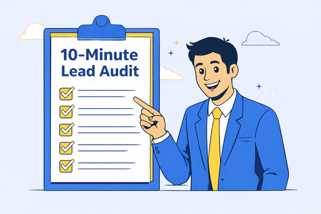
[Insert image of a simple checklist graphic labeled “10-Minute Lead Audit” because it encourages readers to actually complete the steps.]
What to fix first (so you don’t spiral)
If you’re overwhelmed, start here-in this order:
- Clarity at the top: service + area + next step
- Mobile CTA: tappable phone + dominant button
- Form confidence: short form + clear success + fast delivery
- Trust near the action: proof placed next to the CTA
- Speed basics: images + hosting + page weight
This order works because it targets the fastest conversion wins.
You’re not trying to build a “perfect website.” You’re trying to build a website that makes contacting you feel obvious and safe.
Quick recap
Most cleaning business websites don’t get leads because they:
- don’t confirm relevance fast enough,
- don’t build trust quickly,
- and create friction at the moment someone tries to contact them-especially on mobile.
That’s fixable. And you don’t need to become technical to make the biggest improvements.